I worked in animated TV commercials for a lot of years. The good thing about commercials was that they had relatively high budgets (at least compared to TV series) and there was a variety of designs and technical challenges.
Eventually, though, I reached a limit. One of the main reasons was dealing with people from advertising agencies and their clients. Now, you can experience the wonders of ad agency folks without having to work nights and weekends to give them what they want. Check out this website, which claims to be verbatim comments. Based on my experience, I'd say that was an accurate statement.
Wednesday, January 31, 2007
Monday, January 29, 2007
Letter from Irv Spence
I've been struggling to write something for the last several days and it's just not coming together. This blog has been quiet for almost a week, which is too long, so it's time to go to the filing cabinet and pull something out.
This letter from Irv Spence was in response to questions I sent him about MGM. It was my only communication with Spence and there aren't any historical revelations here, but I like the letter for it's breezy tone and for Spence's enthusiasm. At the time he wrote this, he was approaching forty years in the business and he was still having fun. We should all be so lucky.

The illustration at left is from the Cartoon Diary blog, which reproduces images from Irv Spence's diary of 1944. That's Spence at the drawing board.
April 16, 1976
Dear Mr. Mayerson
Sorry about being a bit late - will explain later. Hope I can be of some help in regard to your questions about the animation business.
Speaking about Warners and MGM, the footage requirements were just about the same. However, MGM wanted more full or more Disney quality so the footage per week was about 20 or 25 ft. where as at Warners it was more like 30 or 35 ft. per week. As for the studios - MGM cartoon dept. had a much nicer setup than the old Warner bldg. I think Fred Quimby's set up was one of the best in the old days. The ideal cartoon studio. Not too big or too small.
I first went to MGM in 1938. They were doing The Captain and the Kids. I animated in those first two years for George Gordon, Friz Freleng, Hugh Harman and Rudy Ising. Then I began animating for Hanna and Barbera on the first Tom and Jerrys. Yes, Joe and Bill wanted a bit more realism in the animation on Tom and Jerry. Tex Avery wanted very extreme poses and wilder action. Sometimes Tex wanted really wild stuff - and wow! - it was great on the screen.
George Gordon left MGM after directing there, then went with John Sutherland Studios. He directed with the studio for many years then went with Quartet Films in Hollywood doing commercials for several years. Gordon did some outstanding industrial films for Sutherland. The best.
As for UPA, yes their style did influence other studios somewhat. Yes, the budgets did shrink and the animation got more stylized I suppose. Less full animation, more held poses, etc. etc.
I moved from MGM in '56. I was told the studio or rather the MGM main lot was going to discontinue making cartoons. So I made the move to commercial cartoons for TV. In 1963 I was back with my old basses Joe and Bill. Worked on The Flinstones, Johnny Quest, two features, then did commercials again for them, working with Art Babbitt. In 1969 I left Hanna and Barbera and made the big move to Ralph Bakshi. We are now animating(what I think will be a great film) a feature called the War Wizards. It's full animation and it's great fun to go all the way with animation.
Well Mark, it's nice hearing from you. Hope I've helped you somewhat. I could go on and on about this wonderful animation art. I've been doing it a long time but still enjoy it very much. It's a rewarding art form. If there's anything more, let's hear from you.
Sincerely,
Irv Spence
Oh yeah. My wife and I took a nice trip to New Zealand then came home and landed in the hospital with pneumonia. That's why you haven't gotten this reply sooner. -Irv
This letter from Irv Spence was in response to questions I sent him about MGM. It was my only communication with Spence and there aren't any historical revelations here, but I like the letter for it's breezy tone and for Spence's enthusiasm. At the time he wrote this, he was approaching forty years in the business and he was still having fun. We should all be so lucky.
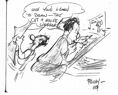
The illustration at left is from the Cartoon Diary blog, which reproduces images from Irv Spence's diary of 1944. That's Spence at the drawing board.
April 16, 1976
Dear Mr. Mayerson
Sorry about being a bit late - will explain later. Hope I can be of some help in regard to your questions about the animation business.
Speaking about Warners and MGM, the footage requirements were just about the same. However, MGM wanted more full or more Disney quality so the footage per week was about 20 or 25 ft. where as at Warners it was more like 30 or 35 ft. per week. As for the studios - MGM cartoon dept. had a much nicer setup than the old Warner bldg. I think Fred Quimby's set up was one of the best in the old days. The ideal cartoon studio. Not too big or too small.
I first went to MGM in 1938. They were doing The Captain and the Kids. I animated in those first two years for George Gordon, Friz Freleng, Hugh Harman and Rudy Ising. Then I began animating for Hanna and Barbera on the first Tom and Jerrys. Yes, Joe and Bill wanted a bit more realism in the animation on Tom and Jerry. Tex Avery wanted very extreme poses and wilder action. Sometimes Tex wanted really wild stuff - and wow! - it was great on the screen.
George Gordon left MGM after directing there, then went with John Sutherland Studios. He directed with the studio for many years then went with Quartet Films in Hollywood doing commercials for several years. Gordon did some outstanding industrial films for Sutherland. The best.
As for UPA, yes their style did influence other studios somewhat. Yes, the budgets did shrink and the animation got more stylized I suppose. Less full animation, more held poses, etc. etc.
I moved from MGM in '56. I was told the studio or rather the MGM main lot was going to discontinue making cartoons. So I made the move to commercial cartoons for TV. In 1963 I was back with my old basses Joe and Bill. Worked on The Flinstones, Johnny Quest, two features, then did commercials again for them, working with Art Babbitt. In 1969 I left Hanna and Barbera and made the big move to Ralph Bakshi. We are now animating(what I think will be a great film) a feature called the War Wizards. It's full animation and it's great fun to go all the way with animation.
Well Mark, it's nice hearing from you. Hope I've helped you somewhat. I could go on and on about this wonderful animation art. I've been doing it a long time but still enjoy it very much. It's a rewarding art form. If there's anything more, let's hear from you.
Sincerely,
Irv Spence
Oh yeah. My wife and I took a nice trip to New Zealand then came home and landed in the hospital with pneumonia. That's why you haven't gotten this reply sooner. -Irv
Tuesday, January 23, 2007
Best Animated Feature
By now, you no doubt know that the three nominees for the Best Animated Feature Oscar are Cars, Happy Feet and Monster House.
I find it odd that Arthur and the Invisibles was disqualified for not being 75% animation, yet Happy Feet and Monster House qualify. How much of those films are animated and how much are motion captured? From my perspective, motion capture is not animation, merely a technique whose look imitates animation. The Academy has decided how much animation is necessary for a film that's mixed with live action, but somehow, motion capture is not held to the same standard.
We have to be clear that the animated feature category exists for a technique and not a genre. There is no category for comedy or science fiction films. There is no category for family films, even though this year's animation nominees all fall squarely within that genre. The technique of animation is what stops these films from competing against live action films, for better or worse. Having created the category, the Academy should be vigilant about what it accepts. I would make the analogy that motion capture is like steriod use in professional sports, except that I don't think that motion capture is performance enhancing.
I don't believe much in awards except as a marketing tool, and clearly that's what the Oscars are all about. The films nominated today are the same films they were yesterday; only the perception of those films has changed. Now, they're nominees; in several weeks one will be an Academy Award winner, though it's still the same film.
However, that winning film will probably go on to earn more money on DVD and for TV sales than it would have without the award. The creative team behind that film will most likely be able to charge more for its services and may have opportunities that wouldn't have existed otherwise.
Which is exactly why it's so important that the Best Animated Feature award actually go to an animated film. I wrote here about the issue of fashion; if motion capture is perceived to be better than keyframed animation, motion capture becomes the style and keyframing's opportunities (and the opportunities of its practitioners) are diminished.
I'm not a member of the Academy but I would hope that the members of the animation branch would take this very seriously. It took roughly 60 years from Snow White and the Seven Dwarfs for animated features to grow enough in terms of releases and public acceptance to warrant an award from the Academy. It would be a shame if one of the animation industry's main marketing tools is generalized to any film that looks like animation.
Monday, January 22, 2007
Prepare to Board!
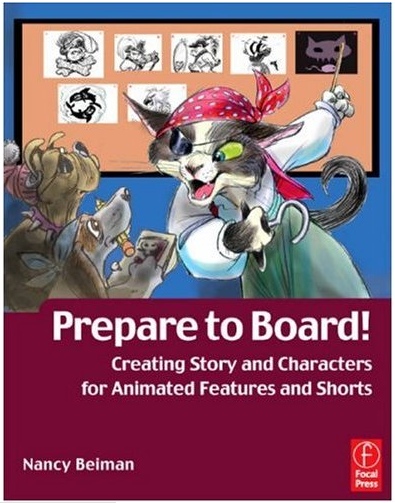 Nancy Beiman has created a commercial for her new book, Prepare to Board! The book is scheduled for release on March 2 and is up for pre-order at Amazon.com.
Nancy's career has included animating on features for Disney and Amblin' as well as stints doing character design, storyboarding, directing and children's book illustration.
She's a long-time friend of mine, so I had the opportunity to read the book in manuscript. I think that it's a solid book on writing and boarding for animation with excellent visual examples. It also features work by some of her students at the Rochester Institute of Technology.
As an added bonus, Nancy has included three previously unpublished interviews with Ken O'Connor, Ken Anderson and T. Hee, which should make the book interesting reading for animation historians as well as artists.
Saturday, January 20, 2007
Dan Haskett Sesame Street Work
This is a Sesame Street spot created by Dan Haskett. Dan is one of the most natural animators I've ever met and it's a shame that he rarely has the opportunity to animate his own thing. It seems like most of the credits I see for Dan are in the area of character design, and while he's excellent at it, nobody moves his designs as well as he does.
When I started out in the '70's in New York, Dan Haskett was miles ahead of the rest of us, and we all knew it. We all wanted to be Dan when we grew up.
Here's another piece Dan did for Sesame Street. There's a four second blackout near the start, but the piece resumes. There's some very expressive dialogue animation here.
Dan may have done other Sesame Street spots, though I can't remember for sure. If anyone knows and can find them online, please let me know and I'll link to them.
Wednesday, January 17, 2007
Dean Yeagle Design Demonstration
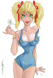
Dean Yeagle will be doing an on-line chalk talk via the Entertainment Art Academy on February 18 from 3-6 p.m. Pacific Time. The cost is $65 and you can find registration information here. Scroll down until you see the drawing at left.
For those not familiar with Dean, he's a long-time animation designer and animator in addition to being a regular gag cartoonist for Playboy for the last 7 years. You can see more of his work at his website.
Tuesday, January 16, 2007
Mother Goose Goes Hollywood Part 3
One of the things that fascinates me about this cartoon is the way it points both forwards and backwards in animation styles. A lot of the Disney cartoons from the 1930's do this. Specifically, I'm fascinated by the differences between Ward Kimball's work and Izzy Klein's.
Kimball, if you haven't guessed, points towards the future. He understands line of action and rhythm in a pose. If you single frame Kimball's work, the poses are very strong silhouettes and the rhythms are pleasing.
By contrast, Klein looks to the past; he started animating at the Hearst studio in the teens and his animation is just fussy. Klein does a pretty good job of capturing the acting style of Oliver Hardy, but his work is less graceful than Hardy himself.
Take a look at these two images. Both are anticipation drawings.

Look at the long, graceful curves in the Kimball drawing. If you look at the left side of the Groucho figure, the curve starts with the hand and travels all the way through the coat tails. If you prefer, you can follow it down the leg to the foot. Those kinds of long curves give the figures a unity and a flow and they're evident in all three characters.
 In Klein's drawing, the lines keep getting stopped by changes in direction. They're short and they tend to bump into other lines. The body parts don't feel tied together because the linework doesn't flow between them. A good assistant animator could clean-sheet this drawing, push the pose a bit and use a rhythmic line to improve this significantly.
The same lack of rhythm in Klein's individual drawings is evident in his animation. It's not enough to draw a rhythmic pose, your path of action has to be rhythmic as well. Just as Klein's lines are fighting each other, the movement of his character's parts fight each other too. The fussiness in the animation is because the poses and actions aren't tied together with rhythm.
Fred Moore didn't work on this cartoon, but Kimball's work couldn't exist without Moore's. Moore used rhythm to unify individual drawings and unify the sequence of drawings into a coherent statement. Kimball got it and Klein didn't, which is why people talk about one and not the other.
Monday, January 15, 2007
Weinman on TV Animation Design
After reading the comments here about the look of King of the Hill, Jaime Weinman has added his thoughts about the nature of prime time animation design.
Sunday, January 14, 2007
Drawing the Line
My review of Tom Sito's book Drawing the Line: The Untold Story of the Animation Unions from Bosko to Bart Simpson is up on the fps site. If you don't want to click through to read it, the short review is that it's an excellent book and worth reading.
King of the Hill Pitch
Here's the pitch trailer that Mike Judge and Greg Daniels used to sell the King of the Hill series to Fox. Jaime Weinman has also posted his thoughts on this piece.
Thursday, January 11, 2007
Whatever Happened to Will Vinton?
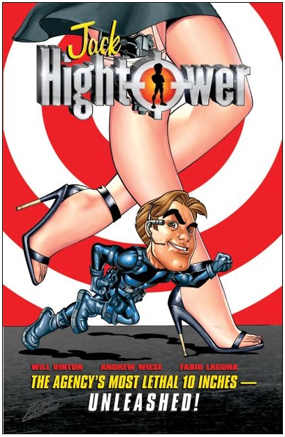
After being booted from the company he founded (now named Laika), he co-wrote a graphic novel called Jack Hightower. He'll be appearing on January 17 at 11 a.m. at the Miami University of Art & Design, talking about the book and his career in animation. More details here.
Wednesday, January 10, 2007
Steve Krantz Has Died
The Comics Reporter notes that producer Steve Krantz passed away last Thursday. Here is Variety's obituary.
Krantz was responsible for some very cheesy TV animation with the Marvel comic book characters in the 1960's. His Marvel Superheroes series used a lot of drawings straight out of the comics, for which the original artists were not compensated. His TV version of Spider-man was the first use of the character in another medium. He was also the producer of Rocket Robin Hood, a series produced in Canada that still evokes nostalgic laughter for its unbelievable cheapness.
The animation that Krantz will be most remembered for, however, were his collaborations with Ralph Bakshi: Fritz the Cat and Heavy Traffic. While those films were hardly high budget affairs, Krantz was willing to take a chance on a completely different kind of animated feature and gave Ralph Bakshi the opportunity of his lifetime. Those two films remain some of Bakshi's most personal and daring work and they blazed a trail that too few animated films have followed.
All things considered, we owe Steve Krantz a thank-you for that.
Sunday, January 07, 2007
Lip Synch Tip
You might not know it from reading this blog, but I was a working animator for decades and am teaching the nuts and bolts of animation right now.
This is something that I figured out while trying to explain lip synch. I don't believe that it's in any of the instruction books. If it is, I wish somebody would let me know, as I'd like to know if I figured this out on my own or unconsciously stole it from somewhere.
Since I'm now making PowerPoint presentations available to my students, I suspect that the files will circulate far and wide as animation notes are likely to do. So I'm staking my claim to this here, assuming that I haven't ripped it off myself.
We exhale when we talk. Generally, vowel sounds are an unrestricted flow of air from our mouths and consonants are a restricted flow of air. The shape of our lips is crucial to getting a vowel to sound right, but it's not nearly as crucial when sounding out a consonant.
If you say "steam room," you'll note that both words end in an 'm' sound, but that your lips are in different positions for each 'm.' You'll also note that your lips don't just move up and down, they also move away and towards the centerline of your face. That's one tip for making your mouth action feel less mechanical.
However, the thing I figured out works out to be a general rule. Say "raid, rod, rude." All three words end with a 'd' sound, but your mouth is in a different position each time. It turns out that the mouth shape of a consonant is determined by the mouth shape of the preceding vowel.
Thursday, January 04, 2007
Kyle Baker in Draw
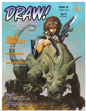 The new issue of Draw is out and it contains part 2 of an interview with cartoonist Kyle Baker. Baker is one of the more entrepreneurial creators out there, self publishing work like The Bakers and he's in progress on a graphic novel based on Nat Turner.
Interviews with Baker are always worth reading for his take on the artist's relationship to the marketplace. Here's a great quote from Draw.
[Warner Bros. was] developing Why I Hate Saturn [one of Baker's graphic novels] as a TV show and when that fell apart, I stayed out there for seven years, doing screenplays and all that junk. And in the old days of Hollywood, they used to give you a whole lot of money up front. Like, when I was at Warner Brothers, they'd give me a big pile of money, a nice contract, and they totally ruined the work, made the script suck. The show never went on, I don't get the script back, etc., etc. But at least I got a big pile of money, and I bought a house. It was worth it. But with the kind of deals that at least I'm getting offered now in animation - I don't know if this is the general deal, but the people are coming to me with is, like, "Okay, here's what we need. We need you. We don't really have much of a development budget anymore, so we want you to practically develop the whole thing before you bring it in. Then we'll pay you about ten grand, and we'll make this thing, and if it succeeds, we get everything, and you get nothing. And if it fails, you get nothing." That's all you end up with now, is, like, ten grand. And it's easy enough to find ten grand somewhere, so that you don't have to give everything up and watch them ruin your script. You know what I mean? I mean, the last thing I did like that, I did a Fox pilot, and that's how much I made, ten grand. It wasn't worth it to me.
Mother Goose Goes Hollywood Part 2
Here we have a cartoon where the animators are cast by character. I don't know if this was Wilfred Jackson's standard approach as a director, but he almost never deviates from it here except for Don Patterson's crowd shots and Stokes and Kimball sharing Fats Waller and Stepin Fetchit. Every time Katharine Hepburn is on screen, it's Bob Stokes. Every time Laurel and Hardy are on screen, it's Izzy Klein. Grim Natwick always gets Charles Laughton, W.C. Fields and Charlie McCarthy. Ward Kimball gets the Marx Brothers and and Jackson knows that Kimball is going to give him energetic animation for the climax.
Jackson was a very highly respected director at Disney. He was famous for planning things down to the smallest detail. His filmography includes The Tortoise and the Hare, The Grasshopper and the Ants, The Band Concert, Music Land, The Country Cousin, Woodland Cafe, The Old Mill and during the '50's co-directing Alice in Wonderland, Peter Pan and Lady and the Tramp. This cartoon is slick as a whistle, with the likenesses of the stars being beautifully maintained and each one given an identifiable piece of business.
1938 was not considered a particularly great year for Hollywood, especially compared to 1939. Had this film been made a year later, I suspect the cast would have been very different. With films like The Wizard of Oz, Gone With the Wind, Mr. Smith Goes to Washington and Stagecoach, we would have seen caricatures of Judy Garland, Vivien Leigh, Jimmy Stewart, John Wayne and maybe even Andy Devine.
T. Hee's designs are generally great, but there are some weaker ones. I don't think that he captured Eddie Cantor all that well. I also don't think that Hee or anybody else ever really caricatured Fats Waller properly. The stereotypical approach to black characters gets in the way; the lower half of Waller's face was all cheeks, not lips. And Waller's eyes are treated generically, when they were probably his most interesting facial feature.
One of the striking things is how simple the layouts are. The backgrounds are relatively spare and the staging is very straightforward. It's clear that this is an animator's cartoon and the crew really pulled out the stops. More on the animation in a future post.
Tuesday, January 02, 2007
A Recommendation
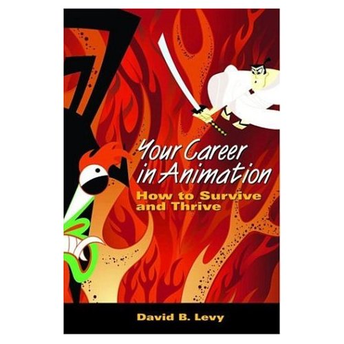 Your Career in Animation by David B. Levy was published last year but I've only just gotten around to reading it. I'm sorry that I didn't get to it earlier, as Levy was at the Ottawa Festival last September and I would have liked to compliment him on this book.
Your Career in Animation is not about how to design, storyboard or animate. This book is about the nature of the animation industry and how you can best enter it and deal with its idiosyncracies. It covers subjects like networking, office politics, being unemployed, freelancing, making independent films and pitching, which are subjects that aren't covered often enough in animation schools.
Levy hasn't just drawn on his own experience; he has interviewed people within the business and shared their experiences as well. My own time in the industry tells me that this book is accurate and Levy's advice is sound. If you're thinking about working in animation, this book is definitely worth reading.
Subscribe to:
Posts (Atom)

